I heard it on the grapevine that today the USA celebrates “Superbow Sunday”, apparently an annual national event of great importance – and who am I to argue with that? In the spirit of mutual understanding, and as a modest contribution to the day’s festivities, I decided to photograph a few of my Superbow sets and share a little research into the origins of Staedtler’s flagship compass design.
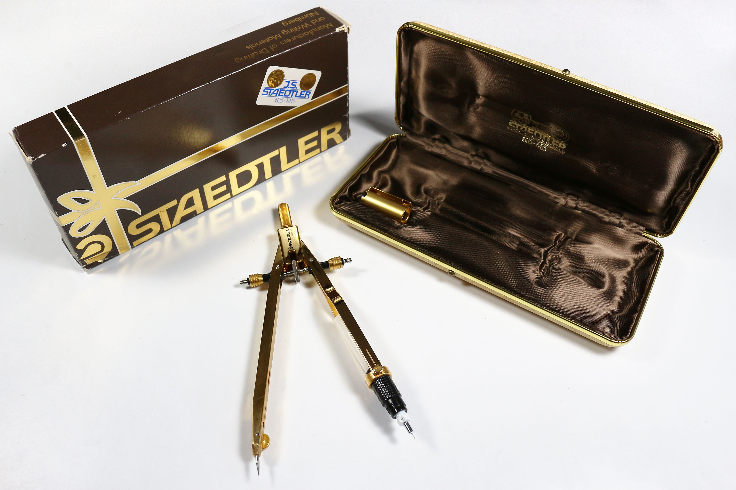
Perhaps the best known of all Superbow models, at least among collectors, is the gold-plated edition 555 85 JSB released to celebrate Staedtler’s 150th anniversary in 1985.

Its appearance coincided with a wider vogue for gold compasses in the 1970s and 80s, often produced for similarly commemorative purposes, with examples known from Rotring, Riefler and Alvin. The gold Superbow came with a matching 0.5 mm technical pen insert with gold-plated cap, and was presented in a fancy brown satin-lined case and shiny gift box.

It must have been produced in reasonably large numbers, as examples appear for sale on a regular basis. Gold plating aside, in most other respects it differed little from the standard Superbow available at the time.
However, by 1985 the Superbow had already been around for some years and passed through a number of design variants. In fact, the first reference to the Superbow that I have managed to locate comes from the second issue of the firm’s in-house publication Staedtler Zeichen-Dienst dating back to 1970, in the form of a short article in the section on “Neue Zeichenmittel” (loosely translated as “new drawing aids”).

The publication was issued on an ad hoc basis, with number 1 released earlier that year under the short-lived Denglisch title Staedtler Zeichen-Service, while number 3 was dated July 1971. This suggests that the Superbow range first appeared around the second half of 1970.

As well as the article, issue 2 featured an advertisement for the new Superbow S on the back cover, possibly the earliest to appear in print. Much is made of the qualities of its quick-adjustment mechanism and spindle lock, in addition to the matt chrome finish and new extension rod design.

It appears that Staedtler were ahead of the game with their move from high gloss to matt chrome, as the 1970 Rotring catalogue still shows their compass range in the former finish.
We know that the Superbow design was patented, as Staedtler’s 1970s catalogues made abundantly clear. However, finding the relevant patent was not entirely straightforward, largely because the patent drawings do not resemble the final product particularly closely. Fortunately, having pinned down the date from the Zeichen-Dienst item, it soon became apparent that German patent 1786134 (applied for 22 August 1968, granted 25 November 1971) for “Zirkel, insbesondere Praezisionszirkel” was indeed the relevant specification. Alongside several other innovations that never made it into production, the drawings show a locking nut arrangement that functions in the same way as the production models, in conjunction with a shallow-pitch spindle and low friction bearings.
Intriguingly, the patent refers to “the proposal of an older application by the applicant” that specified a compass in which “there is the possibility of a rough adjustment as well as the possibility of a fine adjustment, and yet one exact and permanent mutual adjustment of the legs is possible”. This earlier patent may have been abandoned, but the principle is clearly the same, suggesting that Staedtler had been working on the concept for some time.
Nor was this the last patent in relation to the Superbow; over the following fifteen years or so, similar designs appear repeatedly in Staedtler patent and Gebruachsmuster specifications, now more recognisable as the compass as actually manufactured. Over the same period, the design went through a number of largely aesthetic changes, mostly evident in the form of the compass head.
The chevron-like design that first appeared in 1970 gave way to the more minimal angular black head with white “Mars head” logo found in my 553 01 A6 set, the included instruction leaflet datable to November 1980.

This soon morphed into the blue variant of the 553 10 N set (N presumably for “new”), again dated by its instructions to May 1983.

By now the construction felt somewhat cheapened, with clunky steel pins projecting through the plastic head covering.

It also marked a retreat from the minimalism of the 1970s Mars head logo, with Staedtler’s name now prominent on the compasses.

This was by no means the end of the Superbow’s transformation. The 555 line is still available today, although no longer with the trademark locking nuts and patented spindle; the Superbow name has likewise been lost, replaced by the more sober “Mars Professional”. There is potentially much more research to be done on the various Superbow models, of which today’s post represents just the tip of the iceberg, but – as ever – time is short.
For now I will leave you with a recently discovered image of Captain Staedtler hurling some kind of misshapen haggis, the purpose of which eludes me.

However, I have just discovered that the pencil-wielding superhero was a creation of Staedtler UK, based in Pontyclun, Wales, so perhaps it has something to do with rugby. Any further information would be much appreciated.


